Jimmy John's: A Connected Digital Ordering Experience
Making fast feel connected.
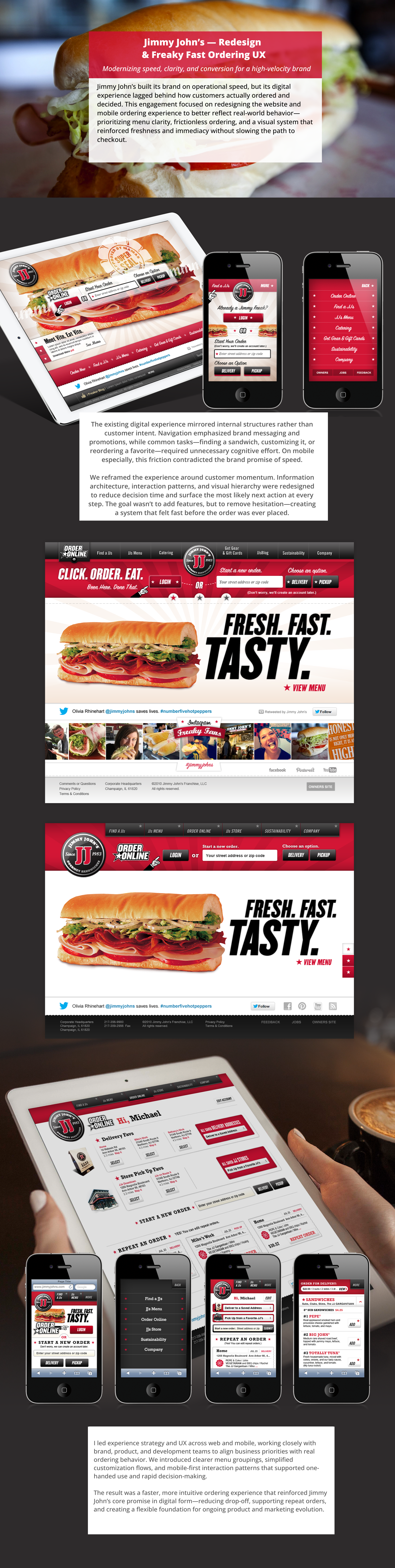
Fast service creates a particular expectation: every digital step should feel immediate, obvious, and connected to the next one. Jimmy John's had a public site, an online-ordering platform, a store, and supporting content surfaces. The work was to give those parts one customer-facing logic.
As Enlighten's VP, Executive Creative Director, I provided executive creative and experience direction across a connected redesign of Jimmy John's public site and online-ordering experience.
A connected visual promise

One journey, several systems
The kickoff record framed a connected set of customer tasks across the public site, online ordering, location finding, the JJ Store, and brand content. That scope made consistency a platform question spanning the full journey.
The flow work mapped people from menu discovery to order start, address entry, store selection, customization, cart, checkout, and confirmation. Store, catering, sustainability, company, and location tasks gathered around that core journey.

Choosing behavior across widths
The responsive question was how the experience should behave as screens changed. Snap-to designs targeted defined states; fluid designs let components resize and stack. The team compared design freedom, ease of updates, client involvement, and future screen sizes.
The client review presented two snap-to and two fluid directions. The first snap-to direction offered a clean, modular, order-first path. Choosing which direction to pursue remained the client's next step.


The first snap-to direction paired a modular desktop home, ordering entry, and mobile state.


The second snap-to direction explored a more image-led, order-first structure across defined screen states.


The first fluid direction tested modular content that could resize and stack as screens narrowed.


The second fluid direction combined flexible behavior with a more expressive visual treatment.
Making service logic explicit
The ordering flows turned a dense service into explicit decisions: location, delivery or pickup, menu selection, customization, group ordering, payment, and confirmation. The work made each handoff visible before the experience moved into detailed design.

Address entry came before store selection, then branched to delivery or pickup. Location became part of the service decision early in the journey.

Extending the shared frame
The visual system carried shared navigation and ordering controls into merchandise and catering. Each specialized journey gained its own hierarchy while remaining part of the same experience model.


Executive direction across one journey
My executive contribution connected brand expression, responsive behavior, ordering logic, content systems, and technical planning around one customer journey.
The artifacts make that collaboration visible across information architecture, responsive strategy, ordering flows, wireframes, visual design, content systems, and technical planning.
Together, the meetings, flows, wireframes, and comps document a clearer direction across public-site discovery, online ordering, store, catering, location, and brand content. From one artifact to the next, the system becomes more coherent.