Enlighten | Building a World-Class Experience Design Practice
Building UX maturity means shaping teams, making smarter decisions, and delivering work people find useful.
I combined interaction design, content, and visual design into one shared practice to make Experience Design clearer and more practical. The work brought human-centered design into cross-functional teams. Real progress came when I connected people through account teams and regular design meetings. That structure helped different disciplines work together, let specialists grow, and clarify priorities.
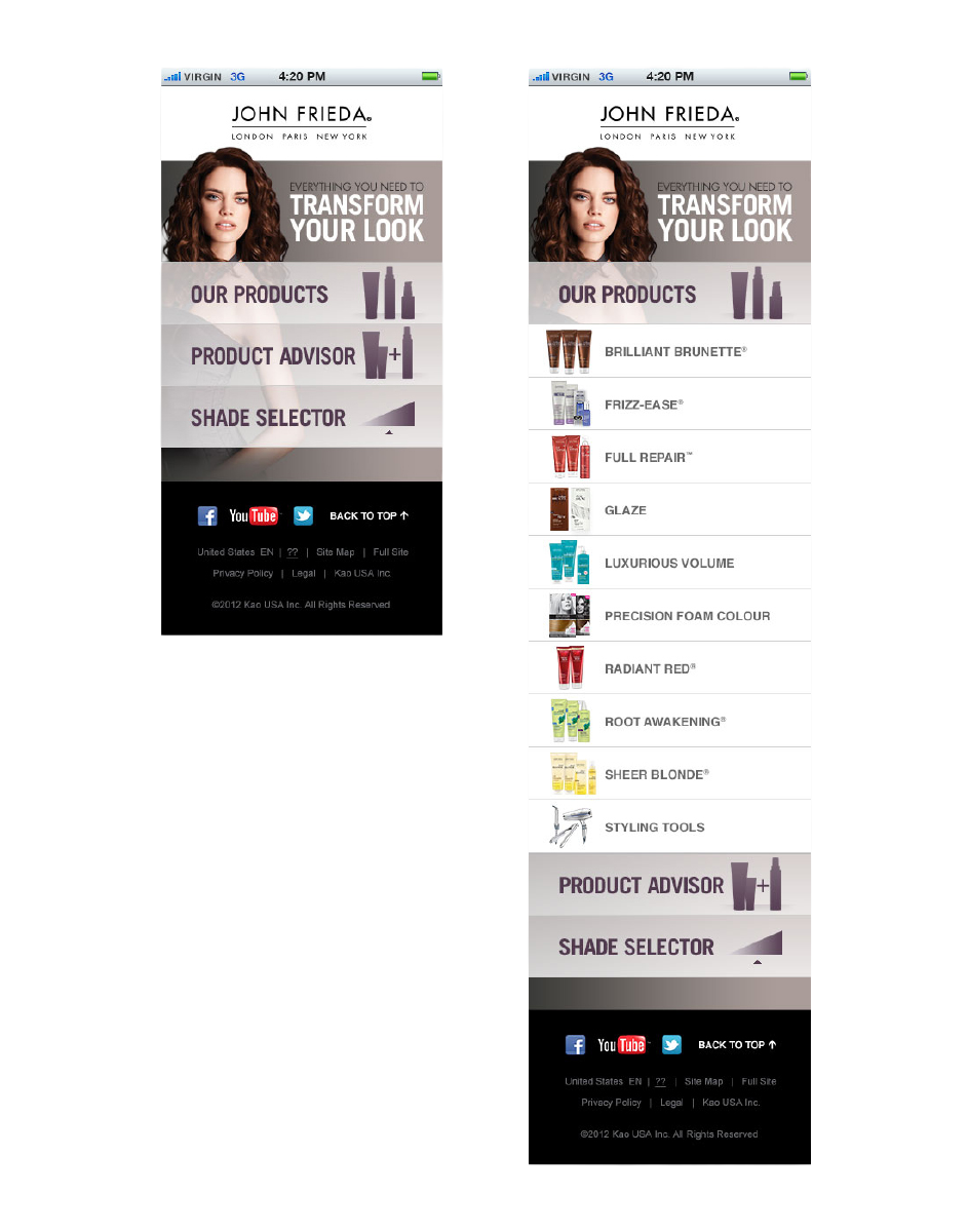
John Frieda · Photography, guidance and brand experience
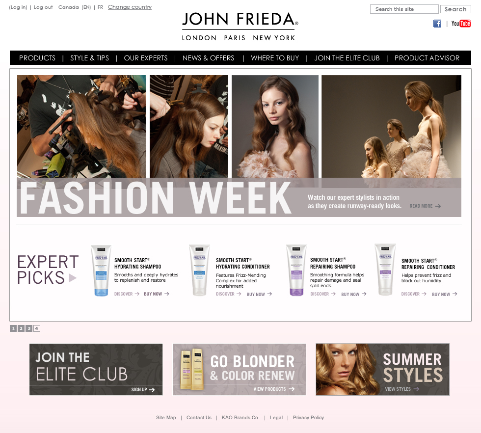


Give the practice a shared structure
As project scopes grew, the work needed more structure. We brought more disciplines together to create a shared way of working, which kept our work clear and usable.
Clients expected more from digital experiences. For example, financial advisors needed to compare and explain funds, banking customers wanted to understand account options, and shoppers looked for helpful product guidance on their phones. Each challenge involved brand, content, interaction, and technology, with different business stakeholders responsible for each part.
As VP and Executive Creative Director, I helped these disciplines work together seamlessly. We organized Experience Design around Interaction Design, Content, and Visual Design, all linked through account teams. My job was to set direction, work with agency leaders and clients, and develop the team so the practice stayed useful as projects changed.
Start with the customer’s useful choices.
Product advice
Product Advisor
Shade selection
Precision Foam Colour
Find a store
Map-enabled store finder
Proposed Define phase
Mobile optimization for the Advisor, with priorities matched to available scope and budget.
Make the practice something people could actually use
I asked for design meetings twice a month and planned to invite engineers to alternating sessions when topics overlapped. Larger Experience Design meetings let people see decisions beyond their own projects. The cadence gave specialists a place to work through content, navigation, and technical challenges together.
Clear roles and team development were just as important as process. We clarified the differences between UX architecture, interaction design, and our job titles. I asked for annual self-assessments and helped shape a paid apprenticeship program with account work, a set cycle, and formal reviews. This gave early-career team members a way in and made coaching a real part of managers’ jobs. The program ran for four to six months, with two formal reviews and a route into associate roles.
My goal was to build a practice that could handle real delivery pressure. We made priorities and scope visible, then used the work itself to review decisions together. John Frieda’s mobile planning, Jimmy John’s ordering flows, and Bioré’s functional prototypes show that approach in concrete form.
Make priorities and scope visible
Priority-setting connected customer needs with commercial constraints. A shared practice needed to make the reasons for including, deferring, or developing a feature visible across the account.
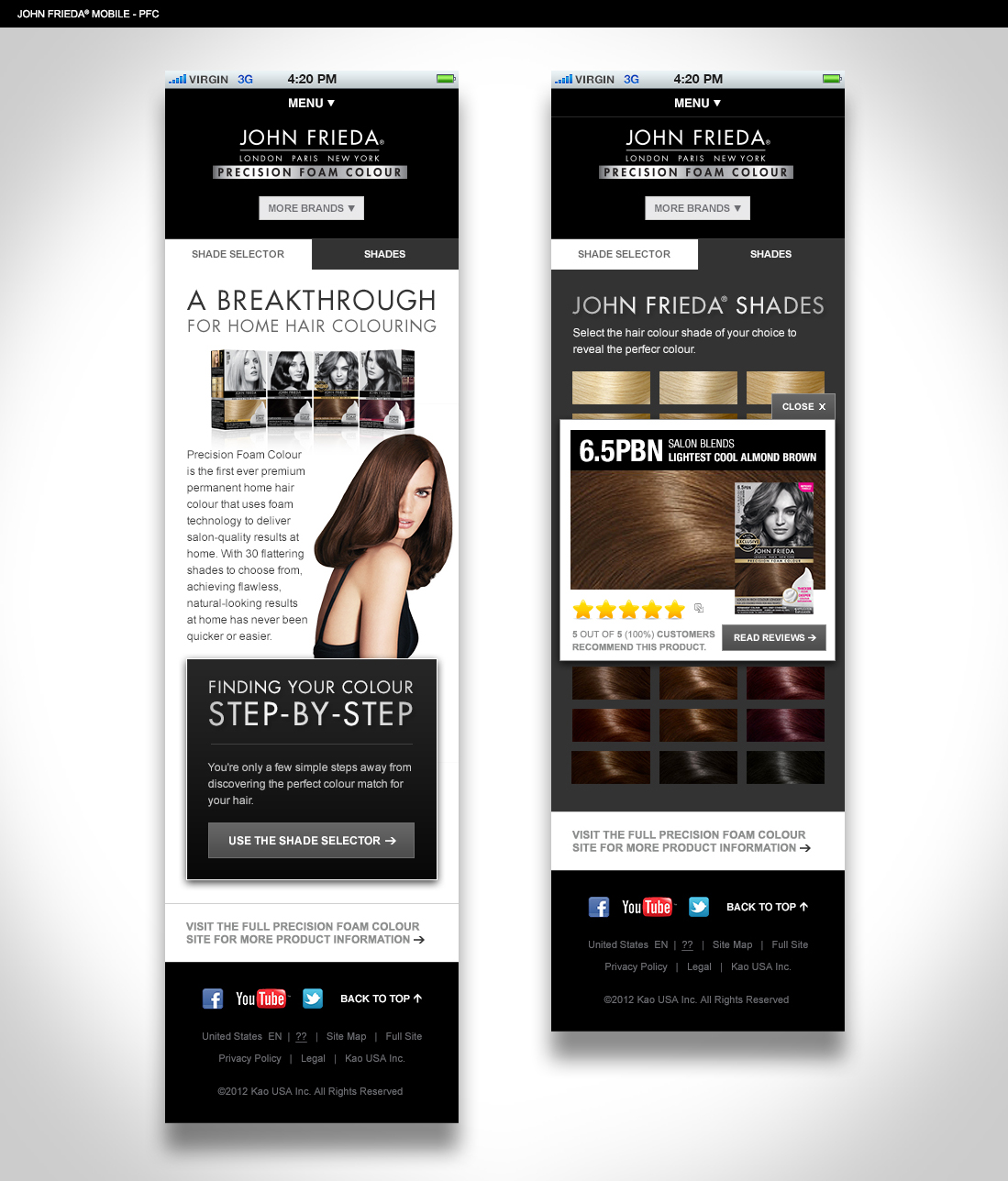
John Frieda’s mobile planning showed how customer tasks and commercial constraints met. The interaction-design recommendation ranked product advice, shade selection, and a map-enabled store finder ahead of supporting features. It also treated mobile optimization as a condition for including the Product Advisor. The team recommended a Define phase to work through available scope and budget. I joined the regroup around scope, deliverables, and the transition so we could consider those choices together.
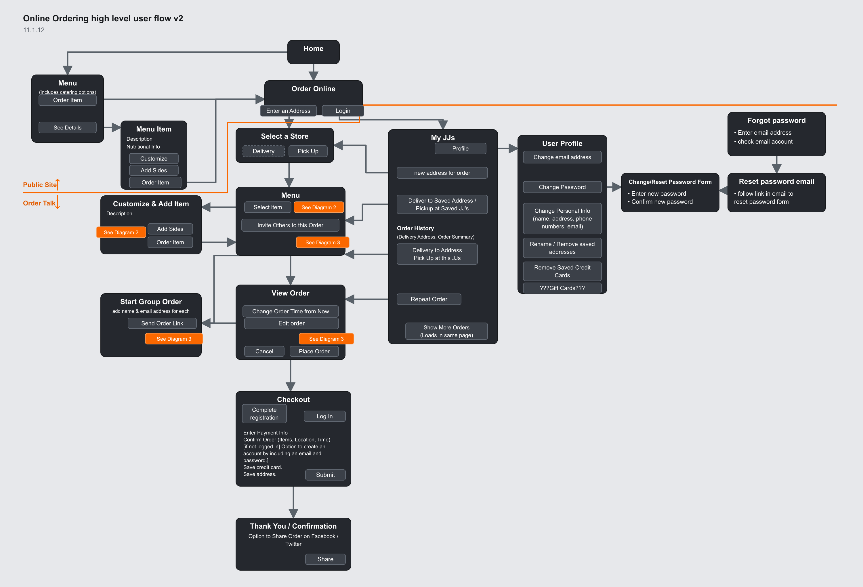
Jimmy John’s presented a different kind of decision: make a complex ordering service understandable to the customer and the team delivering it. The ordering map connected account access, delivery and pickup, item customization, group orders, and checkout. Each branch carried a service or business choice that needed to work with the others. Working with specialists such as Krysta Stone, I helped the account move through those decisions with a shared understanding of the experience.
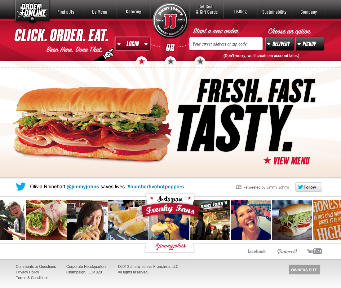
John Frieda · From global site to handheld choices

Turn decisions into shared artifacts
Responsive design made the relationship between customer evidence and design quality visible. A screen had to carry the right priorities for the context in which someone used it.
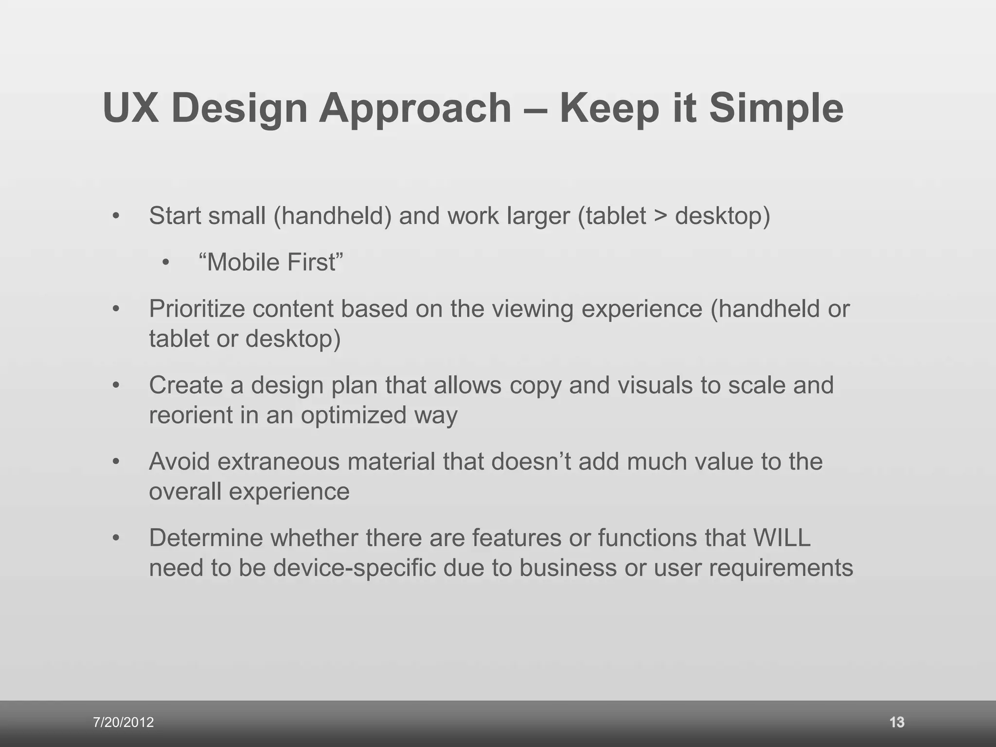
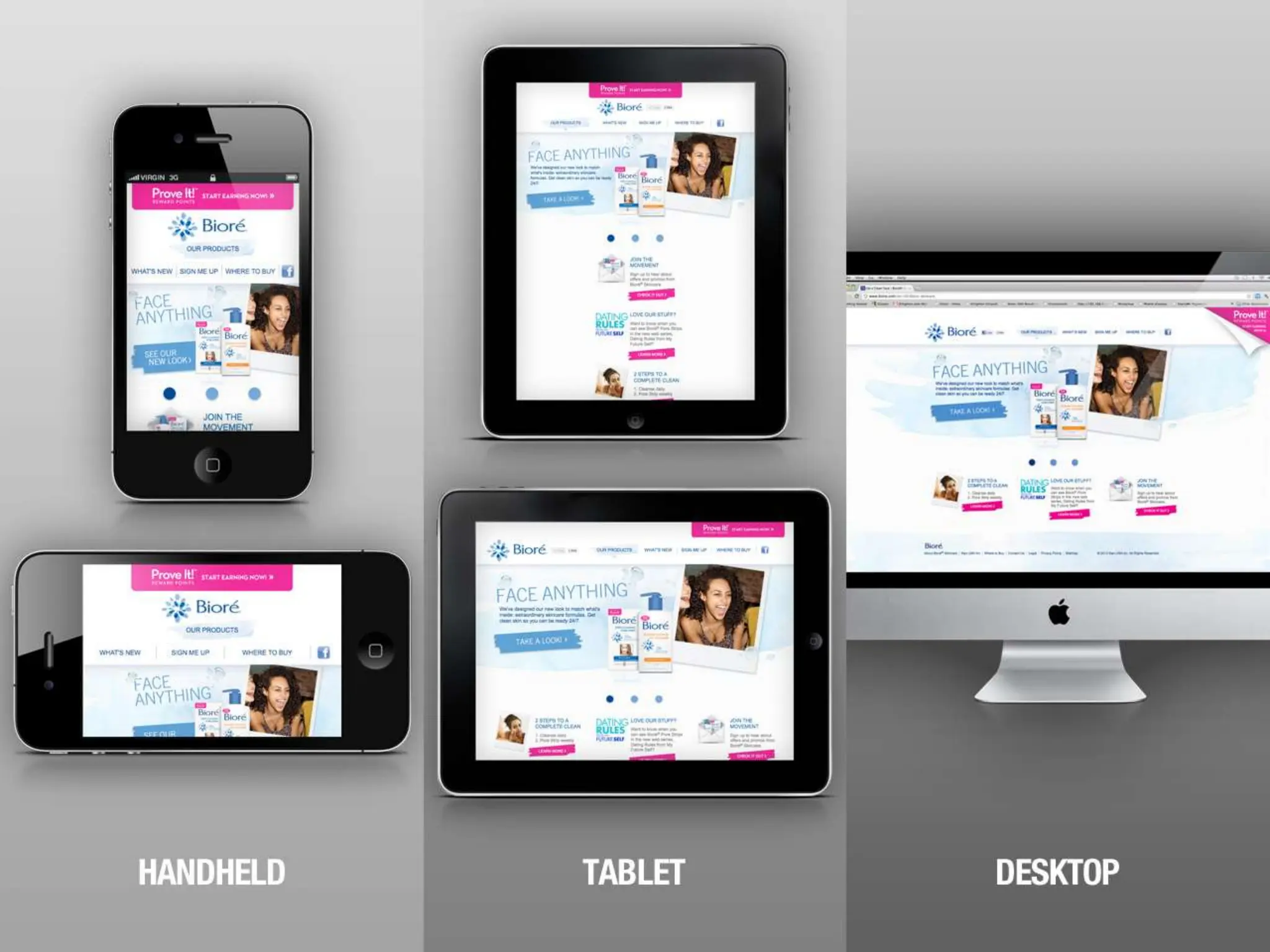
Bioré is an example of turning mobile behavior into design choices. The team’s responsive-design presentation linked audience behavior, site analytics, and competitor reviews to a mobile-first approach. Content priorities started with the handheld experience and expanded to tablet and desktop. Copy and visuals needed a plan for how they would scale and adjust.
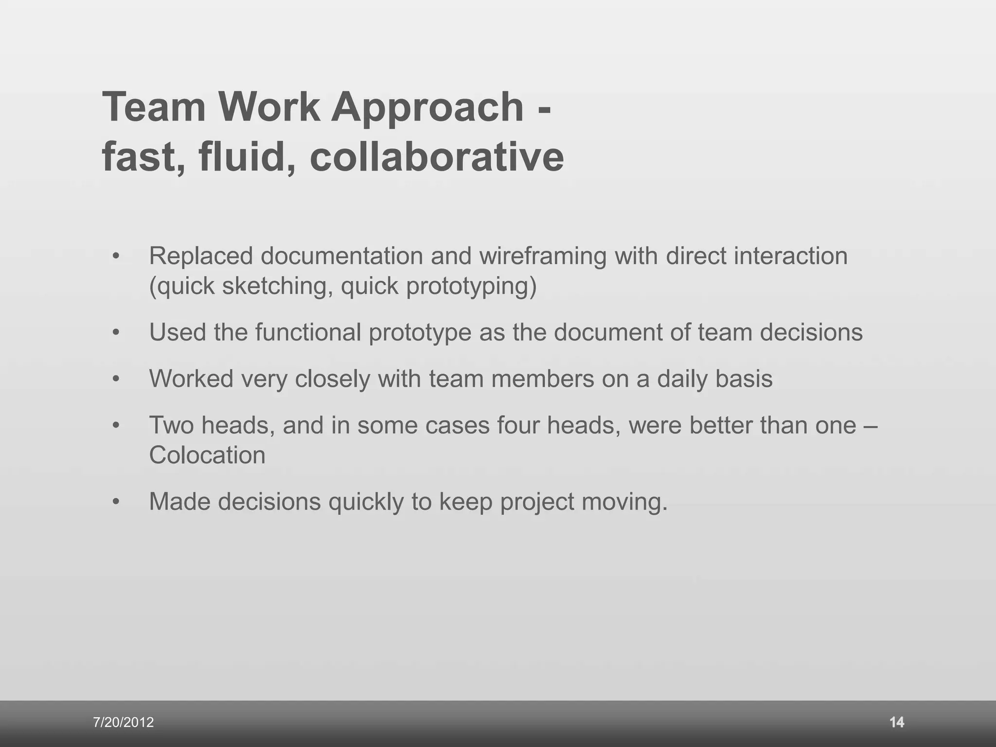
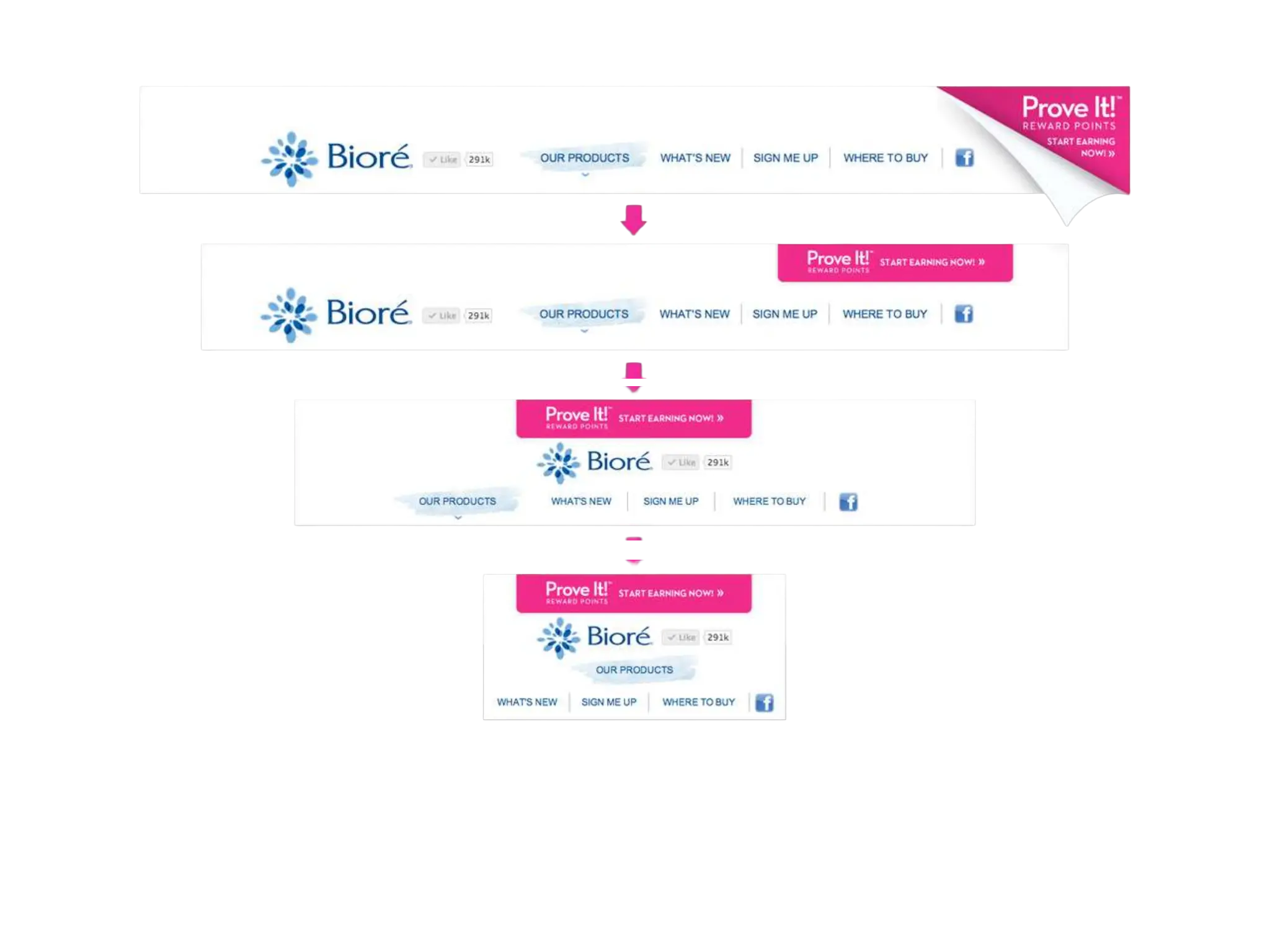
Quick sketches and functional prototypes gave the team a shared record of design decisions. They let content, interaction, and implementation be reviewed together while choices were still open. Navigation shows why that mattered: desktop hover behavior needed a different solution on a smaller screen.
That’s the kind of maturity I wanted the agency to achieve: people who could connect evidence, priorities, design, and implementation through their work. My role was to set direction, develop the team, and create the conditions for collaboration. Design quality became something we could examine in customer tasks, content decisions, and functioning prototypes.
Responsive product navigation
Adapt the interaction to the screen.
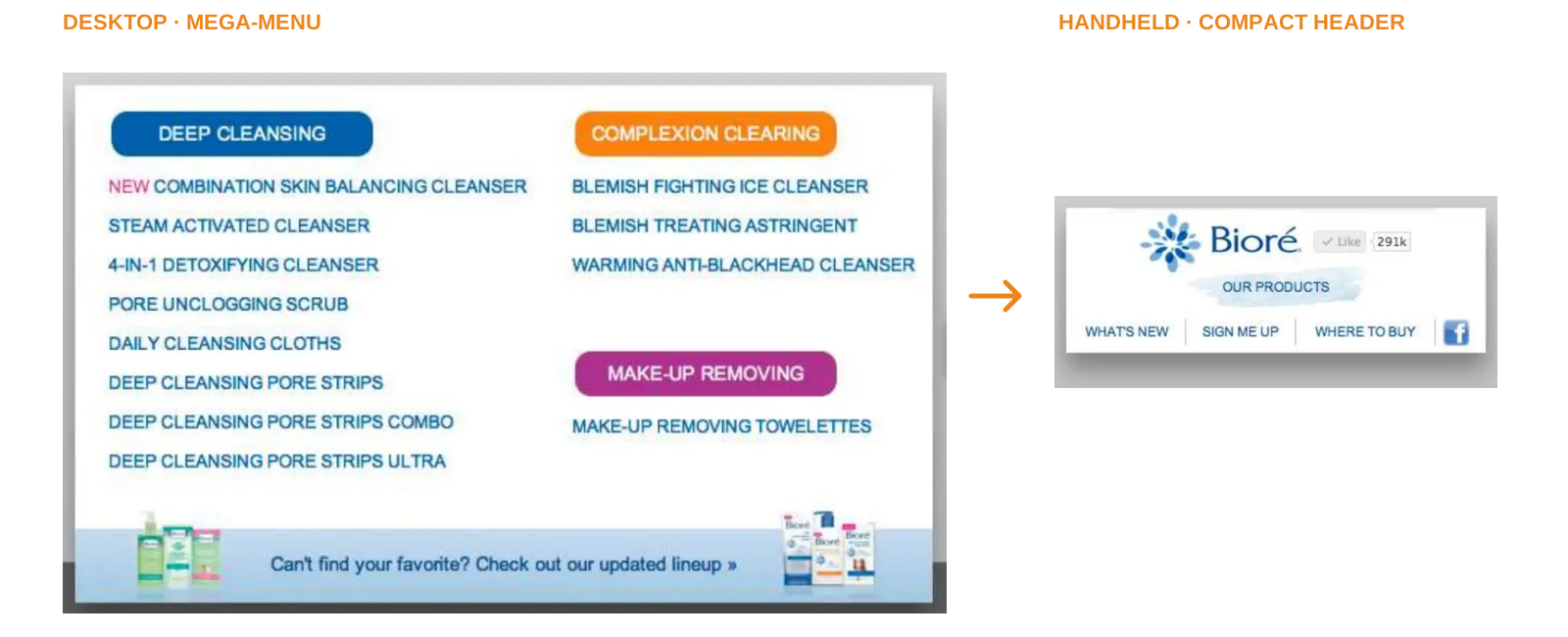
Two brands, two navigation decisions
Apply the practice to financial decisions
Financial-services work gave these habits a consequential test. Customers needed to understand choices with real implications, while business, legal, and compliance stakeholders needed confidence in how information was presented.
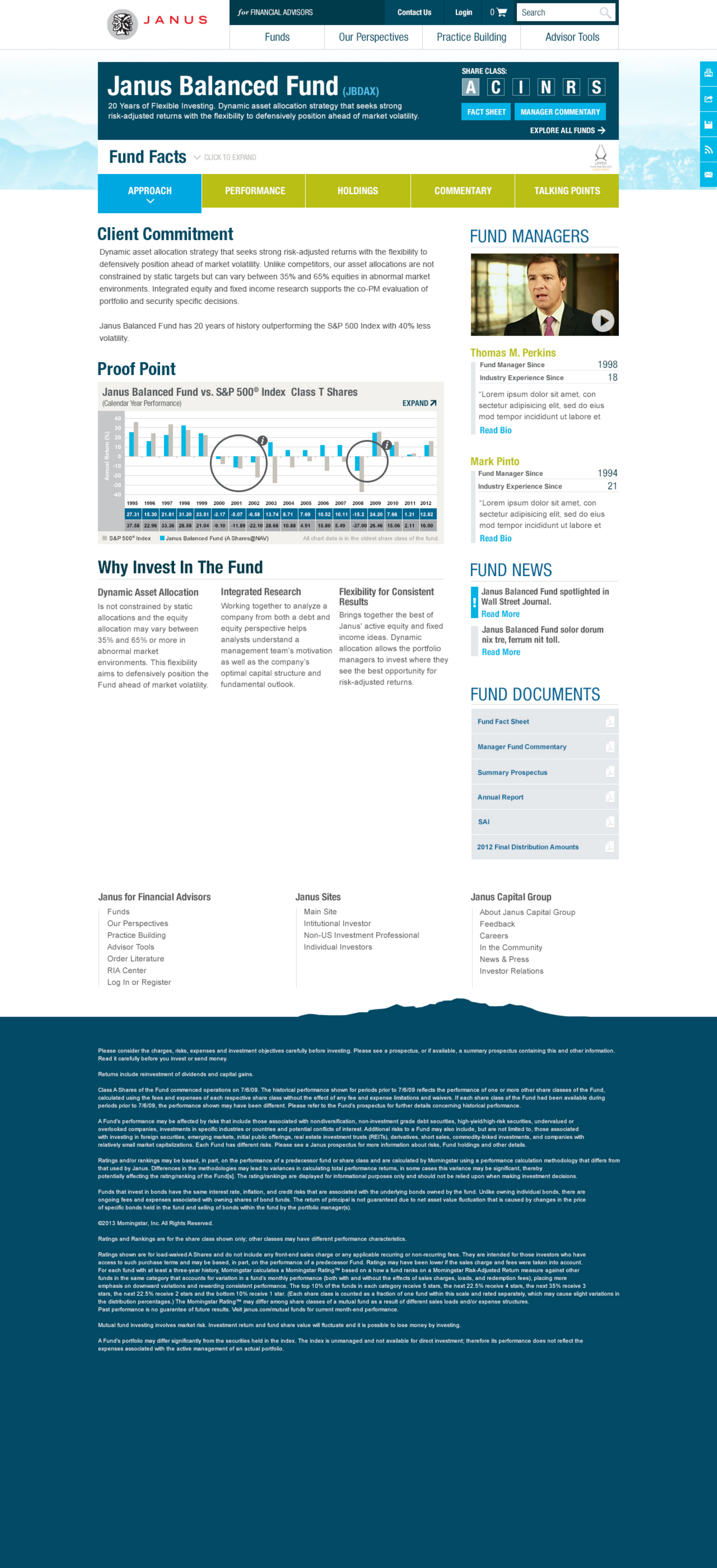
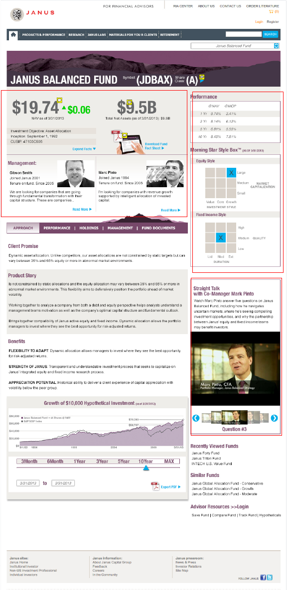
Janus Capital used this approach for financial-advisor work. I met with advisors and Janus leaders, led decisions on fund taxonomy and navigation, guided design reviews and prototypes, and worked with legal and compliance teams. Advisor testing helped us see how the experience supported finding, comparing, and explaining funds. Performance, holdings, risk, fees, commentary, and supporting materials all needed to create a useful investment story.
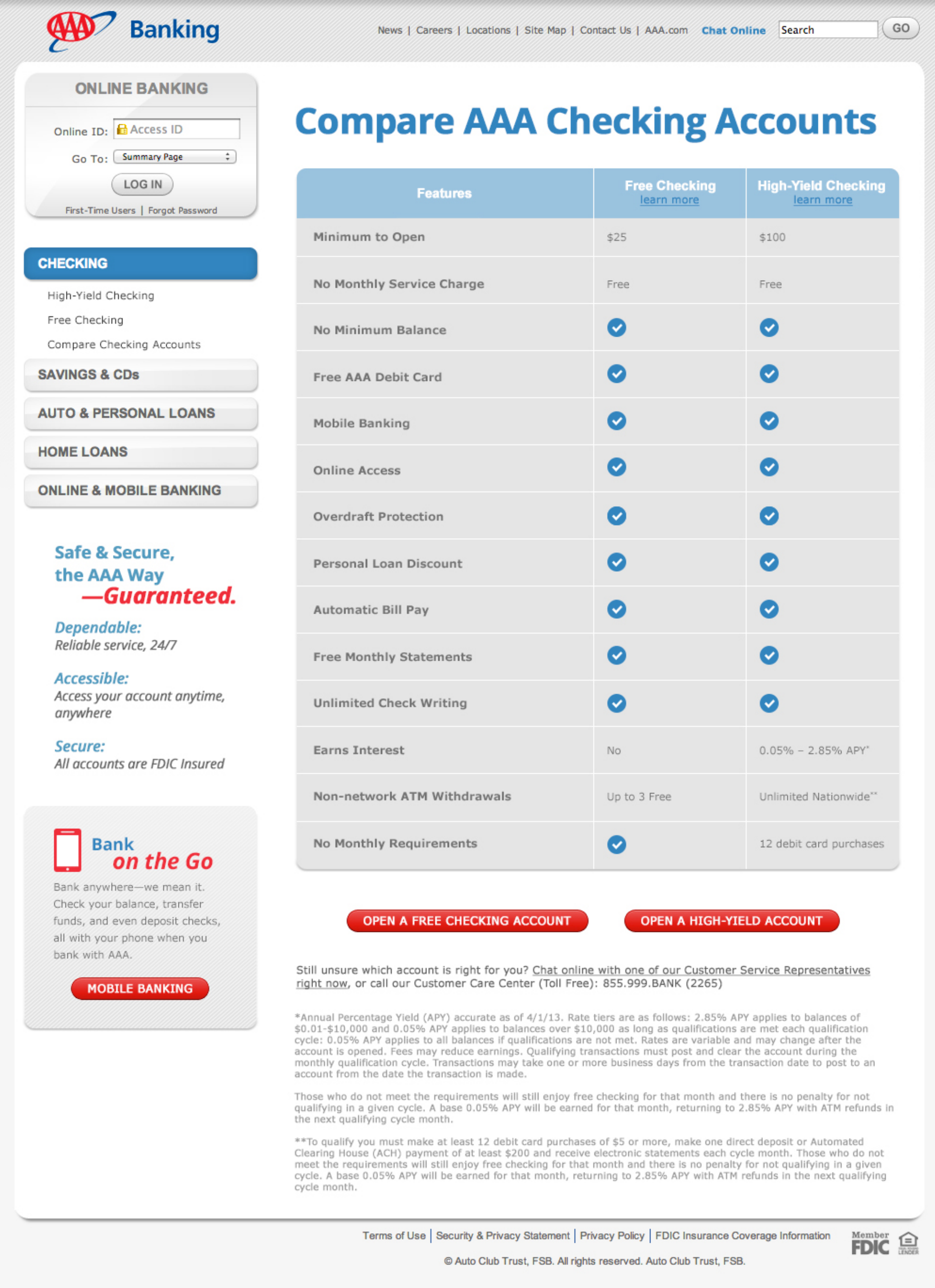
AAA Banking needed clear communication for several audiences: current customers, AAA members thinking about banking, and people new to the brand. I led an eight-person team and directed journey mapping and segmentation. We used interviews and site analytics to improve checking and savings experiences, connecting benefits, requirements, fees, and application choices. After launch, Apply Now clicks and completed applications each rose by 25 percent in the following months. Tracking gaps limited the comparison.
These assignments tested our operating model and revealed real challenges: aligning cross-functional teams with different priorities, handling quick changes in client requirements, and coordinating compliance requirements with delivery priorities. Research, content, design, business analysis, and compliance all helped people make decisions. A common challenge was balancing feedback from many stakeholders while keeping the customer experience clear. My job was to connect these contributions and keep the team’s recommendations clear during executive and client reviews, often by bringing people together in joint sessions to resolve conflicts and find solutions.
What we learned and carried forward from this work
The best proof of our practice is the work itself and the relationships built around it: clear roles, regular feedback, an apprenticeship path, clear customer priorities, and artifacts that helped teams make decisions together. Client feedback also showed the value of collaboration. Enlighten’s president relayed praise for the Janus team’s expertise and attitude, and AAA Life’s leadership recognized the ExpressTerm team’s role in rebuilding client trust on that project.
I bring these lessons to every organization I lead. A strong design practice develops people, makes judgment clear, and keeps the main goals in focus. It gives specialists space to do great work, connects their decisions to customers and the business, and builds trust through results. To keep this maturity over time, I focus on a few key strategies: I regularly review the design process and team roles to keep them aligned with changing business needs. I encourage ongoing learning, adapt frameworks as challenges change, and support open feedback so new ideas can shape our work. By making objectives clear, supporting mentorship across disciplines, and adjusting priorities as client needs shift, I help keep strong delivery and teamwork at the center, even as the organization grows.
Jergens natural Glow
Product guidance makes a personal choice easier to navigate.


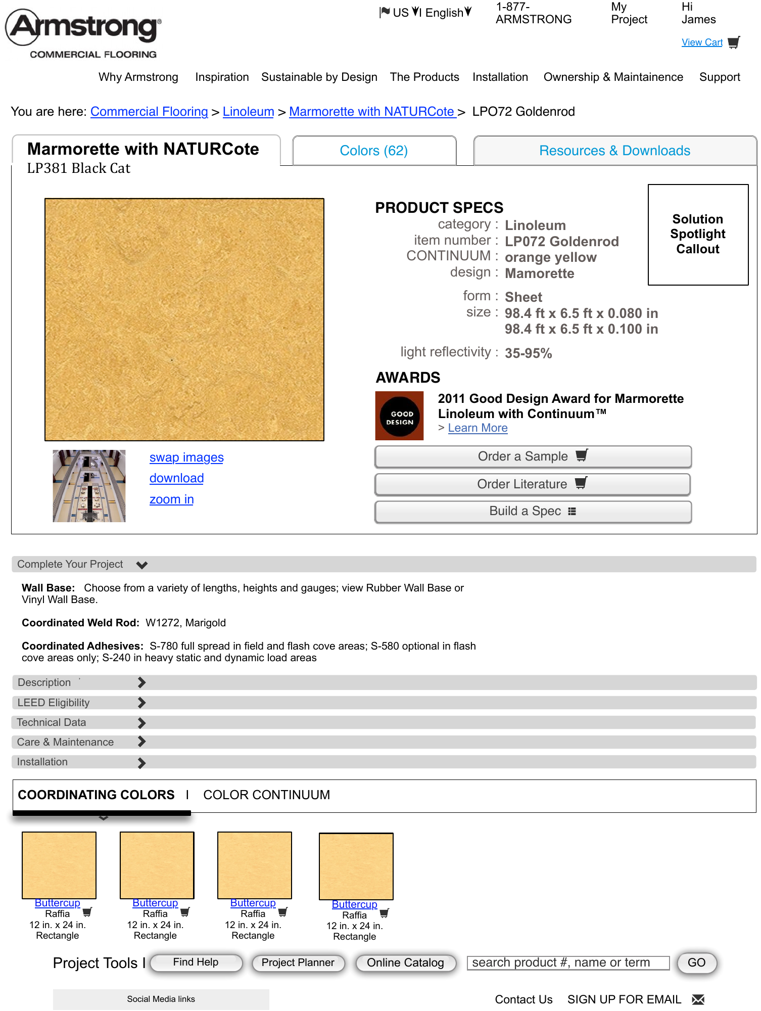
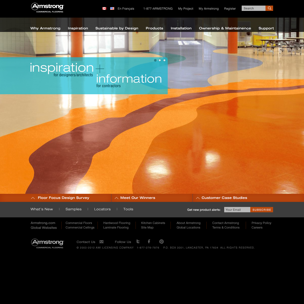
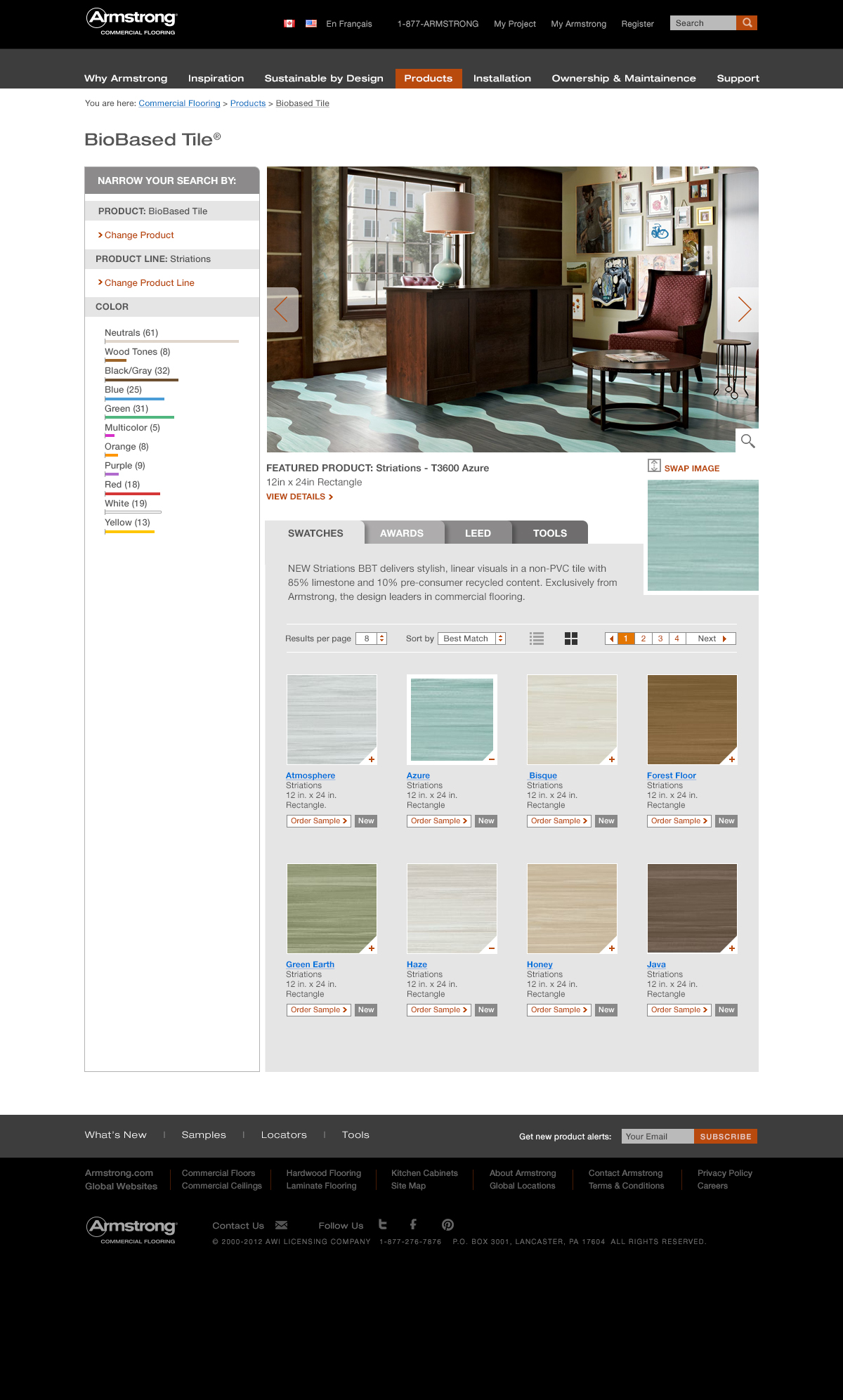
Armstrong
Inspiration, technical detail, and sample ordering support a specification journey.
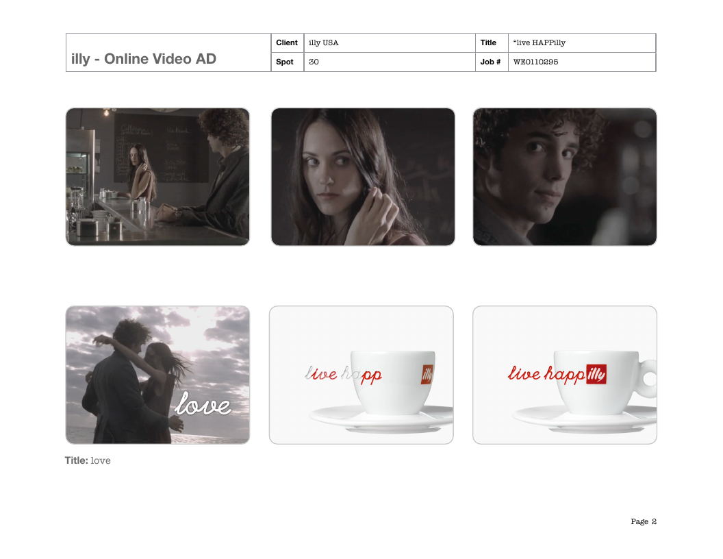
illy
A storyboard turns small human moments into a film and a brand invitation.
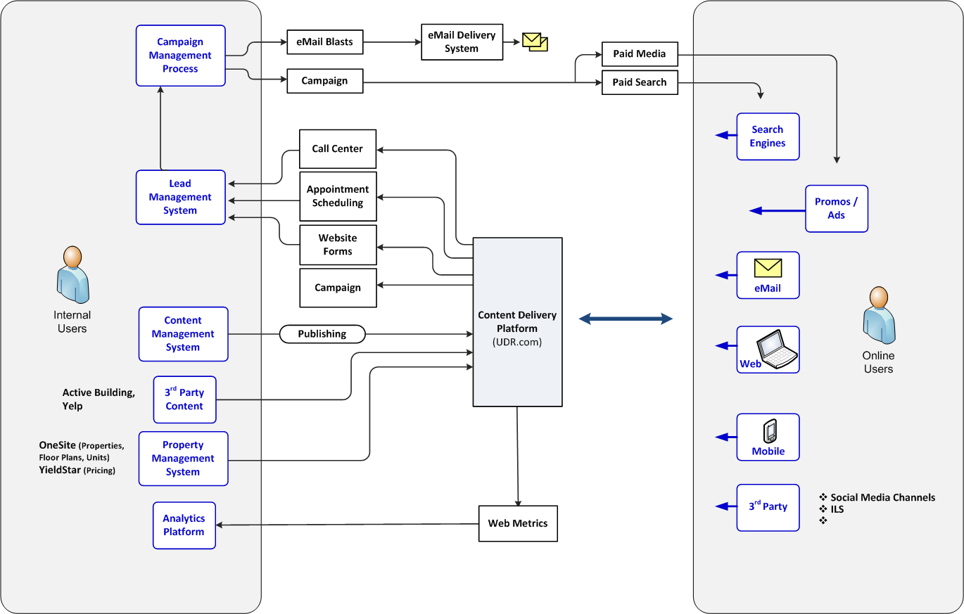
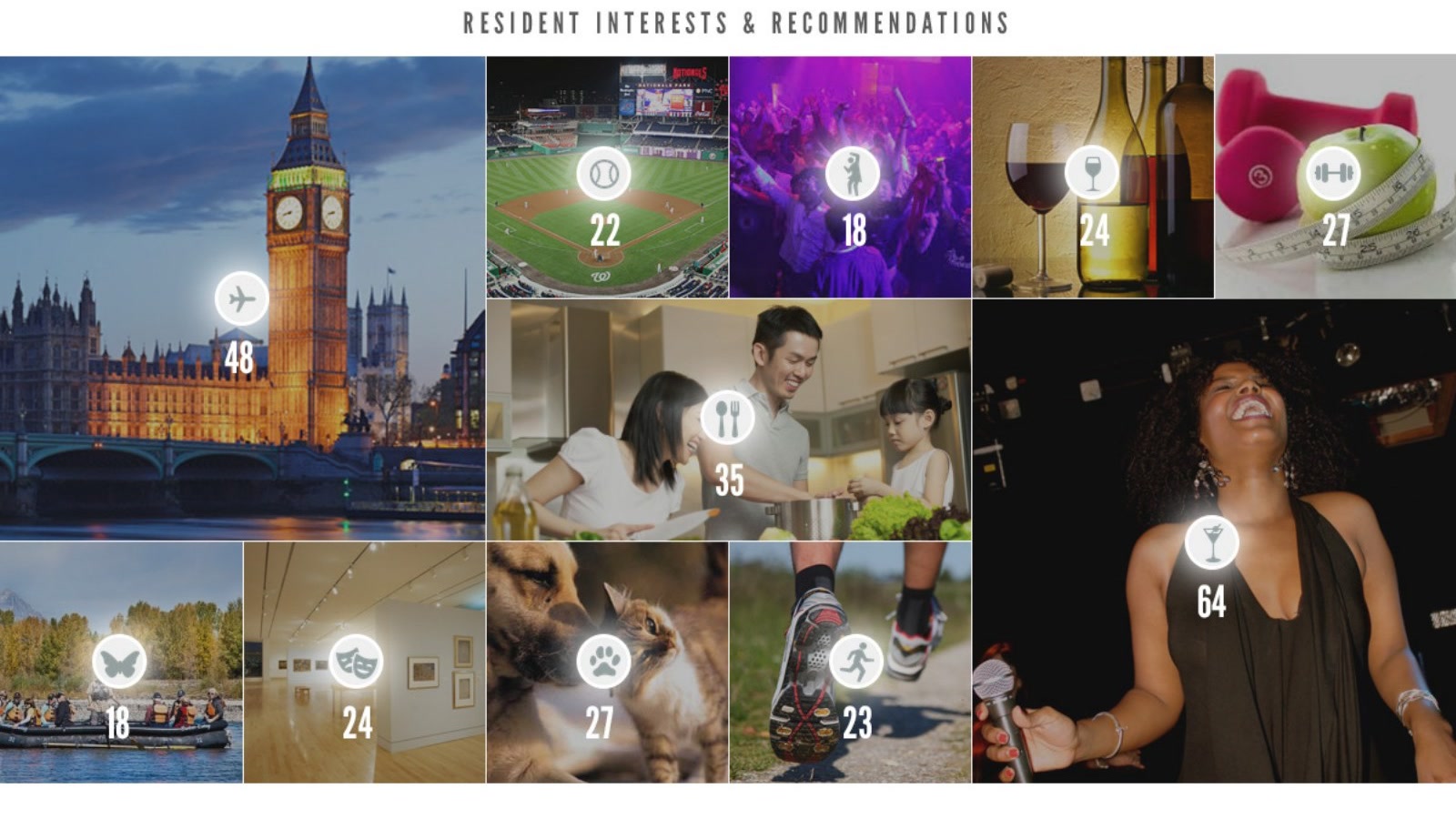
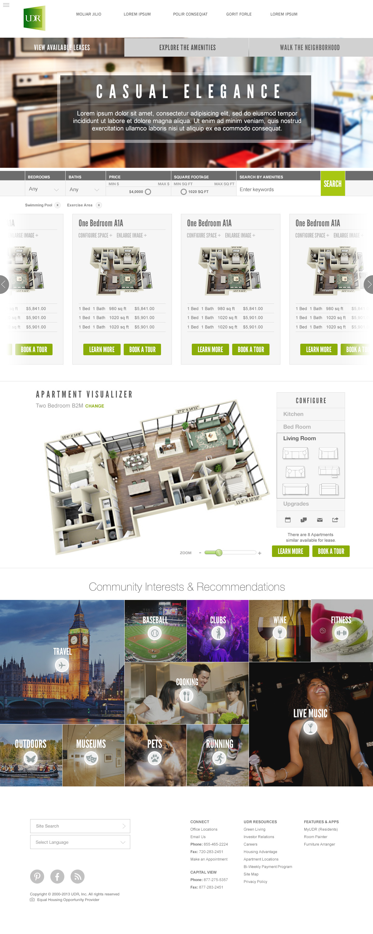
UDR
Property information and neighborhood discovery connect place with everyday life.
Role and collaboration
- Experience Design leadership
- JT Anderson
- Information architecture and interaction design
- Krysta Stone · Jimmy John’s
- Design and delivery collaboration
- Enlighten Experience Design, content, visual design and development teams